Showing posts with label Ancillary Texts. Show all posts

Saturday, 1 April 2017

Final Magazine Advert

Following feedback from my teacher about my magazine advert - I redid the entire thing. I kept the main concept of the idea about the flower with the words around it but changed lots more.
The main things she commented on were..

  1. How it should be portrait not landscape
  2. How it should have more conventions - such as the band name
She also commented on how I should ensure the writing isn't mad difficult to read by the colours chosen. She encouraged me to play around with font and text size. She did like the concept of it and that was why I carried on the colour theme and concept. I made sure all the photos in the magazine were ones I had taken so I used one I had taken in a photo shoot when I filmed the graveyard scene.


Final Website Link

Wednesday, 1 March 2017

Final Photoshop Evidence

https://www.youtube.com/watch?v=YfoZZ-CMQfk&feature=youtu.be

Thursday, 12 January 2017

Photoshop Editing for Logo and Magazine Advert

For the magazine advert. I took a collection of photos myself in a graveyard. I also used one of the photos of the roses as the band logo. I then edited the photos in photoshop. Below is the before and after along with evidence.


Photoshop Evidence from Katie Colyer on Vimeo.

I also edited another photo.


Friday, 2 December 2016

Photoshop - Learning How To Use It

I am using photoshop for my magazine advert but I don't really know how to use it. So, I've looked at quite a few websites and YouTube videos e.g. http://www.photoshoplab.com/photoshop-tool-basics.html

Thursday, 1 December 2016

Audience Feedback of Website

Audience Feedback
My Responses

I collected a small group of people together to look at my website so far.


The bit about the actors with their interests and aspirations etc was really well liked. They liked the fact it had both their parts as well as outside hobbies. I was worried people wouldn't like the differing backgrounds of the actor pictures but because they are symmetrical, people said it was still aesthetically pleasing so the background difference didn't matter. They also said the pages were really clear and easy to navigate. They didn't have too much writing or stuff going on that it was overwhelming. 

They liked the merchandise page but think they layout and font should be changed. They think the item descriptions should be more clearly linked, e.g. by both being in a box together rather than the item in a bordered picture and the writing just on the page in no box. They really liked the header at the top and think the font should reflect that. They did the prices were believable though and that the page was very clear and simple. There is a link to fanmade merch on the page and they liked the idea of it but thought it looked a little out of place. So, it was suggested that that link gets put in a little box by itself. I agree the font should match the title so that there is a continuum of themes and to make it look professional. I think putting the descriptions and ETSY link into boxes are also good ideas that I will probably do.

They thought the slideshow was a nice addition and liked the captions. However, I did have to explain what the slideshow was at first so I think a small explanatory bit of text next to it might be needed. They thought it would be a good idea to move the slideshow to the centre or make it the main feature of the page because there is a fair bit of blank space on the page and the slideshow could use the space better rather than being shoved in the corner like it is at the moment. I will definitely be adding some text to explain or just introduce the slide show and I might move the slideshow depending on whether I find other stuff to fill the gap.

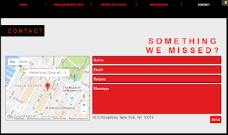
They thought the contact bit was really simple and effective. They liked the colours of it. However, they think rather than having the address under the contact form, it should be in a bar on the bottom or something with more contact details to look more professional. I don't think adding extra contact details is necessary as there is a contact form. So, I think I will leave the contact section as it is.

Saturday, 26 November 2016

Choosing the ancillary tasks

Magazine Advert
The song I'm doing would fit really well with Kerrang! magazine especially as Kerrang! has featured My Chemical Romance in the past. Also, Kerrang!'s target audience very much matches my own as it is mainly young people who like rock and emoish music.


Website

People are more often looking to the web for information about bands and music etc. So, I have decided to do a website. I also chose to do this because it can provide so much more to pull a customer in. For example, there is no limit to what you can have. You aren't restricted by pages or to one sheet of A4 paper. Also, you can show customers sneak peeks of videos, clips of songs etc which can't be shown with a digi pack.

Digi Pack
I chose not to do a digi pack because more people consume music by listening through online services (e.g. Spotify) or by buying it digitally. So, less people get CDs with digi packs.

Tuesday, 22 November 2016

Ancillary Text - Website Planning

What I want to include

  1. Black and red theme to fit in with music video and MCR's general themes
  2. Easy to read font
  3. Behind the scenes section inc photos and possibly vlogs e.g. photos from popular girl photoshoot
  4. A merch page with the merchandise having a border or frame especially if I have a dark background to make it look more professional
  5. Record label logo i.e. Warner Music Group and band logo
  6. Link to iTunes or Spotify
  7. A possible short clip of the song with a button on the front page
  8. Contact form with possible FAQ or title "Got a question for us

Ancillary Texts - Real Website Analysis


Panic! At The Disco
I really like the artwork at the top of the screen and it really makes you interested and the addition of their latest video right there is a good idea. They've also got a nice tour bit which not only gives dates but tells you where is sold out. I like the link to Spotify and the link to Instragram. There's also lots of links to places you can get their latest album. Overall, I like the site as it is easily to navigate and there's the option to go on to other sites if you want to.


Avril Lavigne
This website is quite dark and fits in well with the style and themes of her latest album. There are lots of pages which some are quite wordy. I do really like the first page with the big photo. It is an interesting website though and has a everything a fan could be looking for.


Demi Lovato
This website is the first I've found to have really obvious advertising. I like the addition of the covers of all her old and new albums and the colour scheme is really clean and easy to read. However, I think there are some things on the front cover that don't really need to be there.

Monday, 21 November 2016

Student Ancillary Texts - Magazine Advert Analysis

Demons
The star rating are a nice addition to the advert that would make a customer more likely to buy the album. However, I don't think the colours are bright enough or the font big and clear enough to really catch the customer's eye in the beginning. I like the bottom of the advert with all the ticket details for the tour. The advert overall doesn't give much away about the video so it'd make a customer interested. I do like the fact they used the same setting with the trees as they did in the video.

Mr Blue Sky
This magazine advert goes hand in hand with their video and has really bright eye catching colours which would really grab the attention of the customer. It clearly says when the album is available and shows where you can buy it at the bottom. I think the quote at the top is a really good addition to the poster but it would be nice if it said who the quote is from. I really like how the photo of the characters from the video blends in with the whole background rather than being separate. It makes it flow well and really does make it look like they are in the sky.

Train
I don't think this advert has enough colour to attract the customer to look at it. It is quite dark and grey which may fit in with their theme but doesn't make it look very interesting. I think the photo is a good one, if a little dark. I don't like the font though. It isn't big enough to easily read and it isn't a clear font anyway. There are also blank spaces that look like something should be there but just wasn't ever added. This space could be filled up with a bigger title. I also think the ticket link should be a lot more visible.

Ancillary Text - Magazine Advert

This is my Canva presentation about the conventions of magazine adverts and my initial ideas for what I'd like to do with it.

Student Ancillary Text - Website Analysis


I liked the strong black and white theme in this website and the same font was used continuously for titles which I thought was good. I liked how the main page didn't have too much on it but still had a video and information about an upcoming tour etc. However, I felt like the website had a lot of unnecessary repetition, such as the video being in two different places when it only really needed to be in one. I liked the idea of a photo gallery but I think captions would've been a nice addition. The Sony label in the corner is good as it isn't too in your face but is still there. I liked the store link but I think the tops with a white background looked a bit strange with the page background behind it.

From this website, I've learned that a background doesn't necessarily have to be white to work but if I'm going to have store merchandise with a white background, giving the images a frame or border could be a way to work around it looking unprofessional. I think I'll do the same amount of pages as this website has the right amount to be interesting but not overwhelming. I also really like the idea of having a record label logo on the page.


I really like the link to iTunes to buy the single. However, I think that the music should not play as soon as you enter the website as it could get a bit irritating for fans. It is good that the button to turn it off is very clear and easy to find. I prefer in this website that there is a link to the music video on another page of the website rather than just having the video there twice. I think the theme is quite cutesy and girly which fits the artist well. The layout of all the pages is also very good. There are lots of photos which I think breaks up the text really well and makes the website a lot more interesting and eye catching. However, there are some blank spaces in the background which I think would look better if they were filled with more photos or just a little butterfly like with the main title on the homepage. I think the shop looks really professional and the white background matching the merchandise background makes it all quite visually appealing. The contact page is a good idea but I think it could go well with something as simple as "Got a question? Wondering if Regina will be touring in your area?" above it to make it more clear why a contact form is needed.

I really like the idea of linking to outside websites such as iTunes so I think I'd like to do that. I like the idea of having the song available to listen to but I think I'll have a button or a link, that way the fan gets the option rather than just has it played to them. I'd also label the button to make it clear exactly what it is and what song etc. I really like the idea of having a contact form but with suggestions of questions that could be asked or even a FAQ of stuff that has already been asked and then a contact form with a title like "Got a question not answered here?"


I think having a page just for the sake of someone entering it is pointless and they should just go straight into the homepage. It would make sense if there was the option to sign in to a fan club or something but there isn't. I also think the background is a wasted opportunity because that could've been a photo of the band of the logo or something. However, when you do get to the proper homepage, it is very well laid out and simple without too much irritating blank, unused spaces. Having an email account is a good idea but the placement of it makes it a little hard to read. It would've been better placed on the next page where it is suggested that fans email them. I think the second page is also a bit too informal and has too much writing so fans would lose interest quickly. I think having a music page is a good idea but I think the titles all need capital letters and that it would fit website conventions if the audio clips were just short 30 second clips rather than full length clips because most bands would use this to promote their music and get people to buy the album but why would people buy the album if they can listen to the whole songs on the website for free? I think the events page is pointless because it just has one line on it saying "Events will be added." I don't see why they included it. The band page was okay but had too much writing and grammatical errors. It was interesting in places though.

This website has shown me the importance of getting other people to look over the website to see if there's too much writing. Also, I will make sure not to have grammatical errors in mine. I like the idea of having short audio clips and might use it but I don't think multiple full length clips are the way to go. I like the idea of having an email address and suggesting fans email. I also won't bother with pages that are just there for the sake of it because I think it just makes navigating the website more time consuming for the fans.

Ancillary Text - Website

Conventions of Websites
  • The band name and/or logo at the top which is normally big and eye catching
  • Links to other pages - such as a photo gallery of behind the scenes stuff, a place to log in, a general information bit about the artist, a merchandise store
  • A main feature on the front page such as a video clip
  • A strong design that'll be recognisable to the band but could be minimalistic 
  • A home page that is normally centred around their recent activities i.e. current tour or new album. It also needs to be easy for fans to navigate and simple so they can find exactly what they are looking for
  • Advertisements e.g. banners or links
Ideas
I would like to have a strong black and red theme. However, I want the font to be easy to read so I am considering having the background as a simple white to make it easier for fans navigating the page. I don't want to have too many links because I want the page to be relatively simple. However, I will put a lot of detail into the links I do include. For example, I want to do a big section on behind the scenes stuff and add photos in of settings etc for the music video. The main focus of the home page would be the new video that is coming out. I will probably be using WIX to construct the website.