Monday, 12 December 2016
Tuesday, 6 December 2016
Website Progress
Website Progress by Katie Colyer on Scribd
Friday, 2 December 2016
Photoshop - Learning How To Use It
I am using photoshop for my magazine advert but I don't really know how to use it. So, I've looked at quite a few websites and YouTube videos e.g. http://www.photoshoplab.com/photoshop-tool-basics.html
Thursday, 1 December 2016
Audience Feedback of Website
Audience Feedback
My Responses
I collected a small group of people together to look at my website so far.
The bit about the actors with their interests and aspirations etc was really well liked. They liked the fact it had both their parts as well as outside hobbies. I was worried people wouldn't like the differing backgrounds of the actor pictures but because they are symmetrical, people said it was still aesthetically pleasing so the background difference didn't matter. They also said the pages were really clear and easy to navigate. They didn't have too much writing or stuff going on that it was overwhelming.
They liked the merchandise page but think they layout and font should be changed. They think the item descriptions should be more clearly linked, e.g. by both being in a box together rather than the item in a bordered picture and the writing just on the page in no box. They really liked the header at the top and think the font should reflect that. They did the prices were believable though and that the page was very clear and simple. There is a link to fanmade merch on the page and they liked the idea of it but thought it looked a little out of place. So, it was suggested that that link gets put in a little box by itself. I agree the font should match the title so that there is a continuum of themes and to make it look professional. I think putting the descriptions and ETSY link into boxes are also good ideas that I will probably do.
They thought the slideshow was a nice addition and liked the captions. However, I did have to explain what the slideshow was at first so I think a small explanatory bit of text next to it might be needed. They thought it would be a good idea to move the slideshow to the centre or make it the main feature of the page because there is a fair bit of blank space on the page and the slideshow could use the space better rather than being shoved in the corner like it is at the moment. I will definitely be adding some text to explain or just introduce the slide show and I might move the slideshow depending on whether I find other stuff to fill the gap.
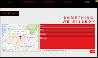
They thought the contact bit was really simple and effective. They liked the colours of it. However, they think rather than having the address under the contact form, it should be in a bar on the bottom or something with more contact details to look more professional. I don't think adding extra contact details is necessary as there is a contact form. So, I think I will leave the contact section as it is.
Subscribe to:
Comments (Atom)


